
Merchant Back Office
Overview
Bytemark is a software company that provides comprehensive transit fare collection and Payment-as-a-service (PaaS) solutions to transit agencies around the globe. The Merchant Back Office (MBO) is a key product within Bytemark’s suite of solutions, a web platform allowing transit agency administrators to manage their customers, partners, and products.
The Opportunity
When I joined Bytemark, the team had already started the process of building a new and improved version of the MBO, calling it MBOJS, with the ultimate goal of migrating every transit agency to the new platform. We saw an immense opportunity to redesign the platform to be more user-friendly, and one of the first things we needed to tackle was Product Management, which is a key function of the platform. Product Management allows transit agency administrators to create and manage products so that riders can purchase and use these products to commute.

Initial Research
Before I dove into brainstorming ideas and creating wireframes, I wanted to take a look at how transit agency administrators were using the existing platform (MBO) to manage their products. Turned out that NO transit agency administrators were using Product Management, and instead, they were relying on our customer service team to create and manage their products. This clearly indicated that there was a problem with the existing Product Management, so bad that the intended users avoided using this key feature.
I sat down with a few transit agency administrators, product managers, and the customer service team to discover some of the reasons why the transit agency administrators were not keen on using Product Management in the MBO.
pain points
When I was a new user, I didn't realize that I had to go back to the navigation to create new product.
In MBO the Create Product action button is hidden in the navigation. Important action buttons should be easy to find.

I tried to look through the product creation page, but it seemed so much easier to create a new product by working with the customer service team. It's just a really long list forms and it looks very outdated...not inviting at all.
The Product Creation page is basically a really long form of dropdowns and fields, which can be intimidating and overwhelming for users.

I didn't know what some of the labels meant, and even the tool tips did not do a great job of describing them...
There’s a lot of jargon used throughout the Product Creation page which confuses the user and slows down the whole process.

Visually, the product details page looks kind of all over the place, and I'm not sure what to look at first...
When the user views the Product Details page, it looks completely different from the Product Creation page and looks disorganized. Lack of consistency and organization makes it difficult for users to read and process information

The Goal
The team’s top priority was to enhance the user experience of Product Management and enable transit agency administrators to create and manage products without entirely relying on the customer service team. Still, we also had to remember that the redesign should avoid significant changes to the existing backend to minimize development time and effort.
Enable users to create and manage products.
Without any help from our customer service team by addressing the pain points gathered from initial research
By reusing existing backend and end points
Brainstorming
The product owners, developers, and I reviewed the existing Product Management screens in MBO to refine the list of things that needed to be migrated or added to the new MBOJS. This was helpful for me to have a clear understanding of the functionality within each page.

Then we went through the existing Product Creation page and grouped the appropriate fields together into six different categories. This was carefully thought out to give the user more context and clarity on how each field affects the product.

Basics
The base information of the product such as name, price, and status
Display
Product descriptions and visuals that riders will see on the customer mobile app
Purchase rules
Defines who, how, and where the product can be purchased
Usage rules
Defines how many times, for how long, and when riders can use the product
Attributes
Sets product filtering
Actions
Allows riders to a certain action with the product like repurchasing the product, or sending the product to another user
Wireframes & Prototypes
After grouping the fields into clear categories, I looked into other sites that allow users to create products like Shopify and Etsy, and came up with a few variations of the product creation page. Once my team and I narrowed it down to two different iterations, I quickly created a click-through prototype for each version and met with our clients for feedback.

Key Findings
Overall feedback was positive, and users felt less intimidated by the product creation page.
Users preferred the tab layout because it allowed them to view all the different categories and easily navigate between them, but it was unclear to them if the save button saved all edits or just the edits within each section.
Users were able to walk us through how they would create a 7-Day Unlimited Pass, but users needed help with the terms to complete the task.
Users didn’t know which fields were required to create a product.
Style Guide
When I took on this project, there was already a base style guide that I could work off of, but there were still many inconsistencies between different screens and components, so I created a design document that would keep the developers and myself accountable for following the guidelines.

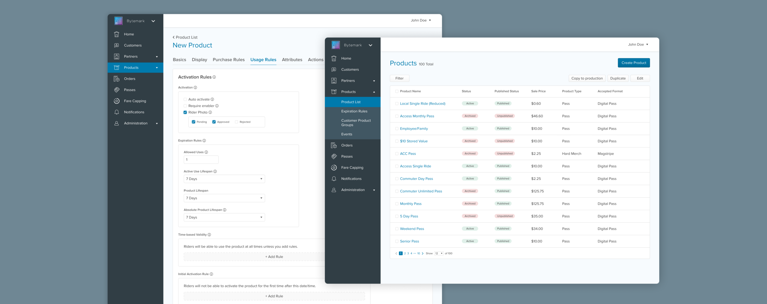
Redesign: Product List
The Products page, which the user can easily find on the left navigation, displays a list of all the products within the transit agency. The user can quickly view each product's most important details on this page, including the status, price, and product type. The design layout from MBO to MBOJS wasn’t too different, but the changes we made allow the user to:
Easily locate the primary action button to create a new product.
Filter the product list.
Apply different actions like duplicating or editing to multiple products.

Redesign: Product Creation
Improving the Product Creation page was the main focus of the Product Management redesign, and it made a difference in making the whole process more appealing to the users. The changes include:
Eliminating unnecessary fields to make the process as concise as possible.
Organizing the fields into appropriate groups and order (gives users more context for the fields, allows users to navigate through different categories easily, and avoids overwhelming the users with so many fields all at once)
Editing the field label names and adding tooltips with clearer descriptions (helps users understand the function of the fields)
Using the same UI and layout for the Product Details page (consistency between the pages when the user creates and edits a product will bring familiarity and minimize confusion for users)

Outcome and Final Thoughts
Once the feature was built, we observed the users create their products. The users’ overall response to the new Product Management feature was positive, but we still needed to refine some areas to shorten the time it takes for the users to create their products.
Outcomes
Users could easily navigate the different Product Management pages and start the product creation process.
Users felt less overwhelmed when they landed on the product creation page.
The fixed buttons at the bottom cleared the confusion of the user saving changes in each section vs saving all changes.
Users contacted our customer service team less but still needed assistance when it came to setting up Attributes.
When the section in Usage Rules got long, users pointed out the pain point of scrolling back to the top of the page to view a different section.
Observing the users go through the Product Creation flow on the platform was insightful and helped me to discover the areas that needed improvements. Through this project, I learned that it is essential to present multiple tasks with different levels of complexity when going through the prototypes with the users to discover small interaction details and pain points that may not be found in a single user flow.