

Customer Web
The Brief
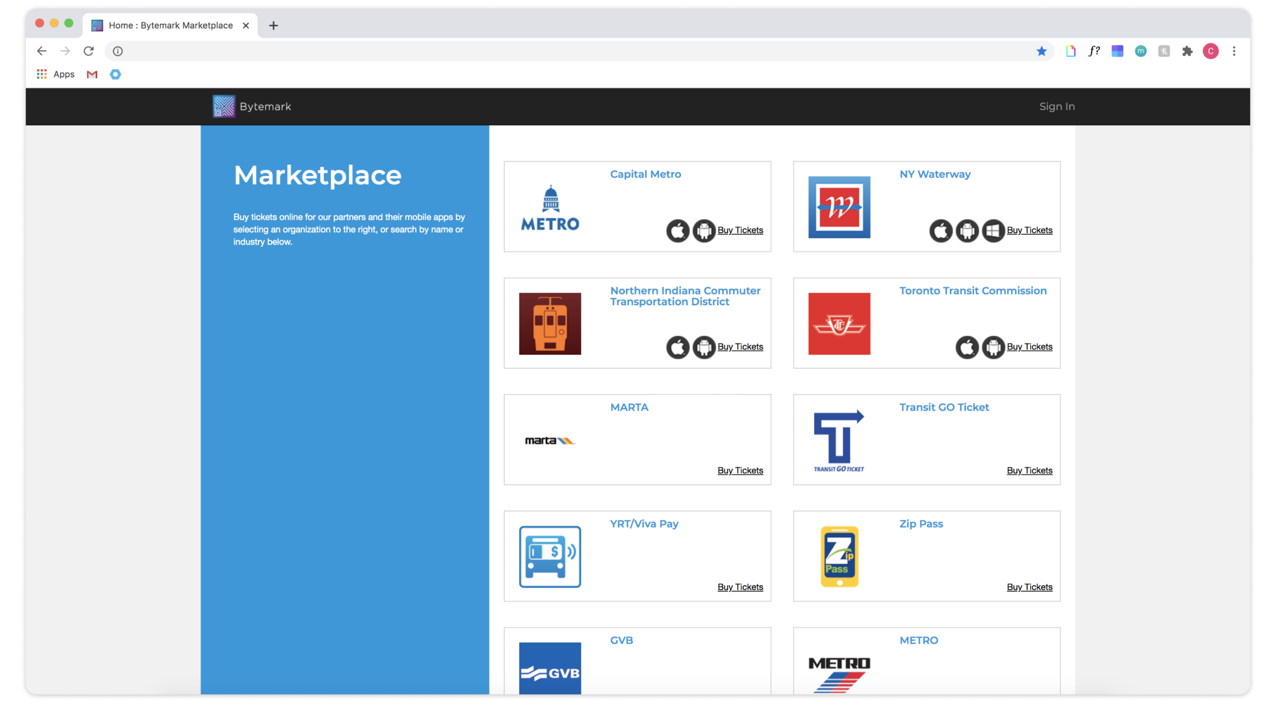
The Customer Web is Bytemark’s consumer facing website that is used by riders to purchase transit passes and to manage their accounts. Before the team built Customer Web, riders purchased their passes through a web portal called Bytemark Marketplace.
The Problem
Bytemark Marketplace had all of the functionalities to allow riders to purchase passes and manage their accounts, but neither riders nor transit agencies were completely pleased with the web portal.
Riders
Didn't know who Bytemark was so when they first saw the home page with Bytemark's logo at the top along with a list of other transit agencies, they often got confused.
Transit Agnecies
Didn't like that the web portal included other transit agencies, and did not display their brand consistently thoughout the different pages.
The Solution
Our team took this opportunity to build a new white-label web portal that would be configurable based on the transit agency’s branding and needs. We also wanted to ensure that this web portal would be responsive to allow users to purchase passes and manage accounts on any device.

Mapping Functionality
Even though the functionality would remain mostly the same, my team and I reviewed the existing structure of Bytemark Marketplace and made some adjustments to make the user flow more seamless.

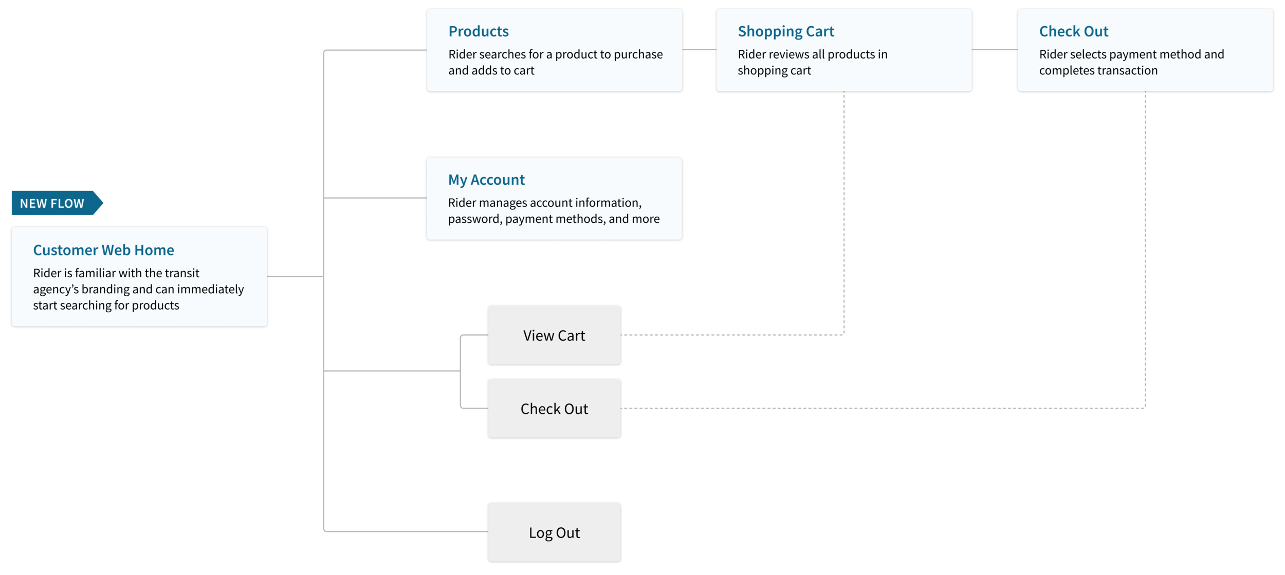
The new flow eliminated the extra step of riders selecting their transit agency and enabled them to search for products right when they landed on the home page. It also cleaned up the site by placing ticket and order history on the “My Account” page.
Wire Frames
The wireframes helped visualize the responsive aspect to the developers and the overall structure of the new web portal. We wanted to keep the design simple and consistent, so we placed the controls and navigation on the left and the content on the right.

Style Guide
Since the Customer Web needed to be configurable, I kept the design very simple and worked with the developers to create color themes so that we knew which parts of the design would change based on the transit agency’s branding.

Home Page
The main purpose of the home page is to display key information about the transit agency and its brand to the riders. The agency can decide to keep the home page or direct the riders straight to the products page. The home page allows riders to select the fields in the elastic search component, which directs them to the Products page with the relevant products.

Products Page
The Products page allows riders to search for products and add them to the cart. Riders can proceed to the shopping cart or go straight to check out to complete their purchase.


My Account
The My Account page allows riders to manage their profile, password, and payment methods, and view their order history and ticket history.

Final Thoughts
Making the Customer Web Portal configurable was a great way for our teams to save development time and effort in the long run. Now, our project managers can use our internal platform, allowing them to easily set the configurations and customize the different colors for each theme based on the transit agency’s branding.